# load in packages
library(tidyverse)
library(janitor)1. Summary
Packages
tidyverse
janitor
Operations
- read in data using
read_csv()
- chain functions together using
%>%
- clean column names using
clean_names()
- create new columns using
mutate()
- select columns using
select()
- make data frame longer using
pivot_longer()
- rename columns using
rename()
- group data using
group_by()
- summarize data using
reframe()
- calculate standard deviation using
sd()
- calculate t-values using
qt()
- expand data frames using
deframe()
- visualize data using
ggplot()
- create histograms using
geom_histogram()
- visualize means and raw data using
geom_point()
- visualize standard deviation, standard error, and confidence intervals using
geom_errorbar()andgeom_pointrange()
Data source
This workshop’s data comes from Tidy Tuesday 2021-10-12, which was from OurWorldinData.org.
2. Code
1. Set up
# read in data
global_catch <- read_csv("global-fishery-catch-by-sector.csv")
2. Cleaning up
This chunk of code cleans the column names, converts catch to catch per million tons, selects columns, makes the data frame longer, and renames the columns.
global_catch_clean <- global_catch %>% # use the global_catch data frame
  clean_names() %>% # clean up column names
  mutate(artisanal = artisanal_small_scale_commercial/1000000,
         industrial = industrial_large_scale_commercial/1000000) %>% # convert catch/1000000
  select(year, artisanal, industrial) %>% # select columns
  pivot_longer(cols = artisanal:industrial) %>% # make the data frame longer
  rename(catch_mil = value,
         fishery_type = name) # rename columns
3. Making a histogram
This chunk of code creates a histogram.
ggplot(data = global_catch_clean,
       aes(x = catch_mil,
           fill = fishery_type)) + # fill the histogram based on the fishery type
  geom_histogram(bins = 9, # set the number of bins
                 alpha = 0.6, # make the columns transparent
                 color = "black", # make the border of the columns black
                 position = "identity") + # make the columns sit on top of each other
  scale_y_continuous(expand = c(0, 0), # get rid of the space between the x-axis and the columns
                     limits = c(0, 35)) # define the y-axis limits
4. Visualizing standard error and confidence intervals
a. Calculations
# calculate the confidence interval "by hand"
global_catch_summary <- global_catch_clean %>%
  group_by(fishery_type) %>%
  reframe(mean = mean(catch_mil), # calculate the mean
            n = length(catch_mil), # count the number of observations
            df = n - 1, # calculate the degrees of freedom
            sd = sd(catch_mil), # calculate the standard deviation
            se = sd/sqrt(n), # calculate the standard error
            tval = qt(p = 0.05/2, df = df, lower.tail = FALSE), # find the t value
            margin = tval*se, # calculate the margin of error
            ci_lower = mean - margin, # calculate the lower bound of the confidence interval
            ci_higher = mean + margin # calculate the upper bound of the confidence interval
          )
This is what your data frame should look like:
global_catch_summary# A tibble: 2 × 10
fishery_type mean n df sd se tval margin ci_lower ci_higher
<chr> <dbl> <int> <dbl> <dbl> <dbl> <dbl> <dbl> <dbl> <dbl>
1 artisanal 15.2 61 60 4.26 0.545 2.00 1.09 14.1 16.3
2 industrial 59.5 61 60 24.2 3.10 2.00 6.21 53.3 65.7b. Visualizations
We want to visualized standard error:
ggplot(data = global_catch_summary,
       aes(x = fishery_type,
           y = mean,
           color = fishery_type)) +
  geom_point(size = 2) +
  geom_errorbar(aes(ymin = mean - se, # plot the standard error
                    ymax = mean + se),
                width = 0.1) +
  labs(title = "Standard error")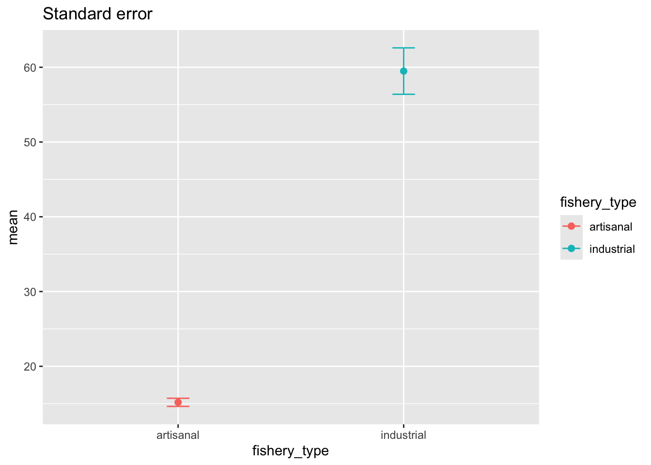
and the 95% confidence interval:
ggplot(data = global_catch_summary,
       aes(x = fishery_type,
           y = mean,
           color = fishery_type)) +
  geom_point(size = 2) +
  geom_errorbar(aes(ymin = mean - margin, # plot the 95% confidence interval
                    ymax = mean + margin),
                width = 0) +
  labs(title = "95% confidence interval")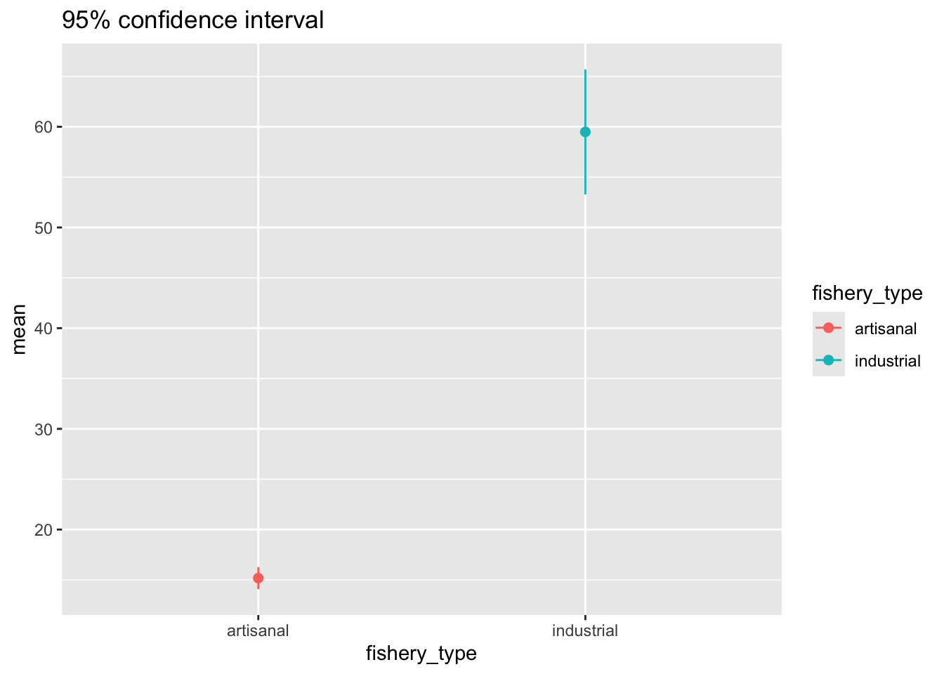
5. Extra stuff
a. Controlling boundaries in a histogram
The general steps to do this are:
- calculate the range
- determine the number of observations
- calculate the number of bins you want (then round to the nearest whole number)
- calculate the width of each bin by taking the range and dividing it by the number of bins - 2 (if the number of bins is odd) or bins - 1 (if the number of bins is even)
- define the line breaks by creating a sequence of numbers, calculating the boundaries for each bin (and if necessary, rounding the boundaries)
# calculate the range
range <- max(global_catch_clean$catch_mil) - min(global_catch_clean$catch_mil)

# determine the number of observations
obs <- nrow(global_catch_clean)

# calculate the number of bins using the Rice Rule
# note that this doesn't come out to a whole number, so it's rounded
bins <- 2*(obs^(1/3)) %>%
  round(digits = 0)

# calculate the width of the bin
binwidth <- range/(bins - 2)

# set up a sequence of numbers from 0 to 100
seq <- seq(from = 0, to = 100, by = 1)

# calculate the axis breaks
axis_breaks <- seq*binwidth + (binwidth/2)

# round the axis breaks
axis_breaks_rounded <- round(axis_breaks,
                             digits = 1)
Then you can make your histogram with the right line breaks:
ggplot(data = global_catch_clean,
       aes(x = catch_mil,
           fill = fishery_type)) +
  geom_histogram(binwidth = binwidth,
                 alpha = 0.6,
                 color = "black",
                 position = "identity") +
  scale_x_continuous(breaks = axis_breaks_rounded) +
  scale_y_continuous(expand = c(0, 0),
                     limits = c(0, 35))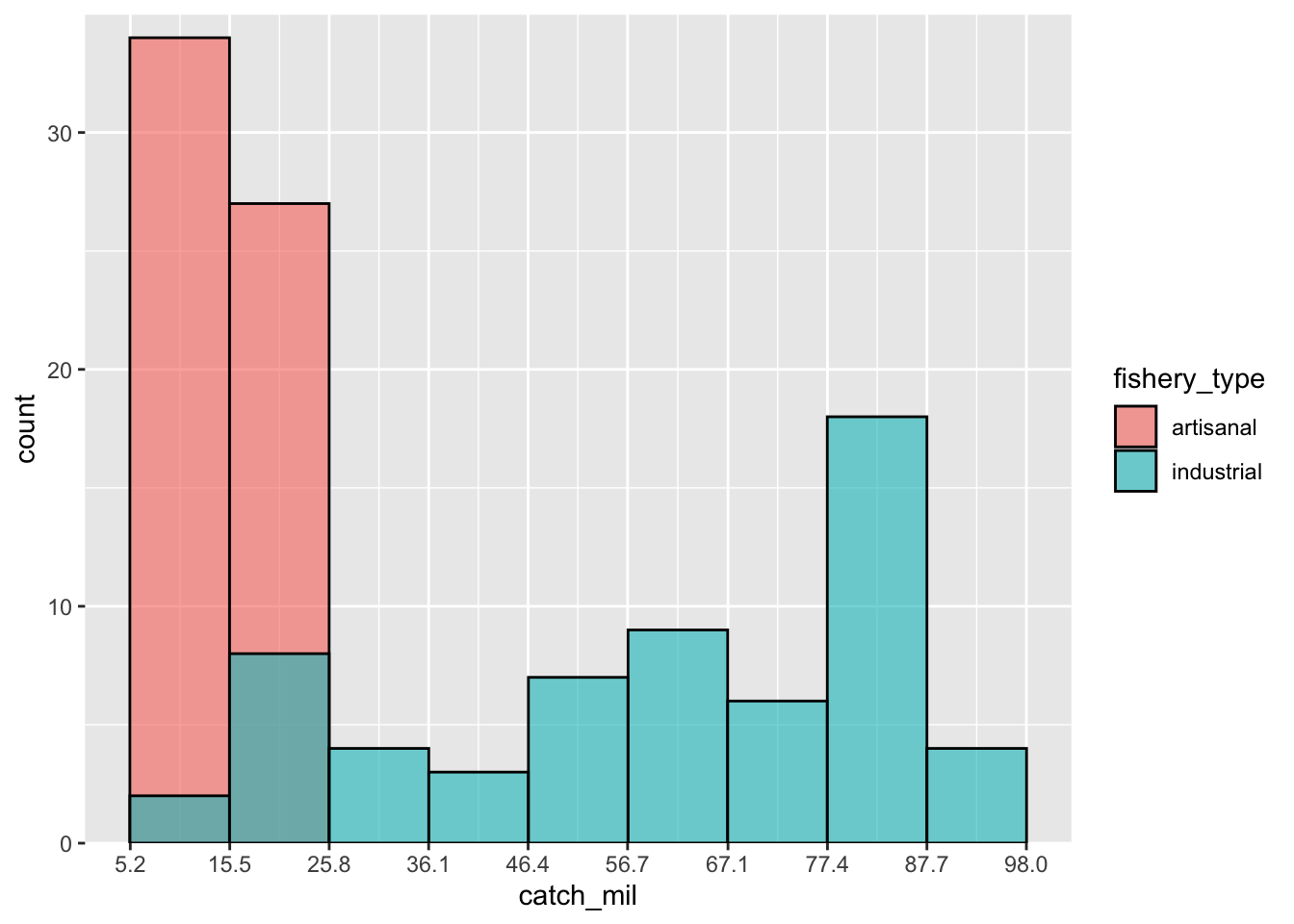
b. plotting the confidence interval using stat_summary
ggplot(data = global_catch_clean,
       aes(x = fishery_type,
           y = catch_mil,
           color = fishery_type)) +
  stat_summary(fun.data = mean_cl_normal,
               geom = "pointrange") +
  labs(title = "95% confidence interval using stat_summary")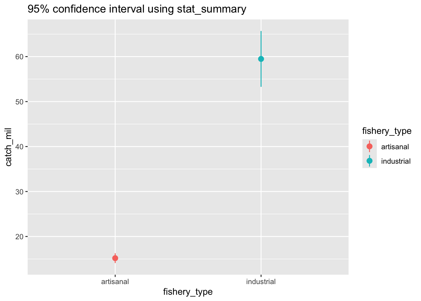
c. calculating the confidence interval with ggplot::mean_cl_normal
# use a function to calculate the confidence interval
global_catch_ci <- global_catch_clean %>%
  group_by(fishery_type) %>%
  summarize(ci = mean_cl_normal(catch_mil)) %>% # calculate the CI using a function
  deframe() # expand the data frame
d. Visualizing standard deviation
This is the same code that you would use if you were making a plot where your whiskers = standard error or whiskers = confidence interval.
ggplot(data = global_catch_summary, # use the summary data frame
       aes(x = fishery_type,
           y = mean,
           color = fishery_type)) + # color the points by fishery type
  geom_point(size = 2) + # plot the mean
  geom_errorbar(aes(ymin = mean - sd, # plot the standard deviation
                    ymax = mean + sd),
                width = 0.1) +
  labs(title = "Standard deviation")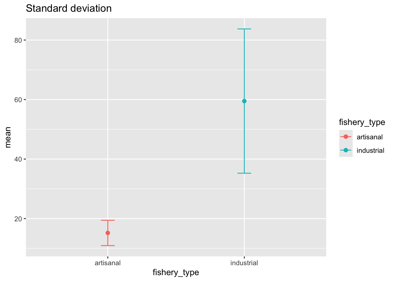
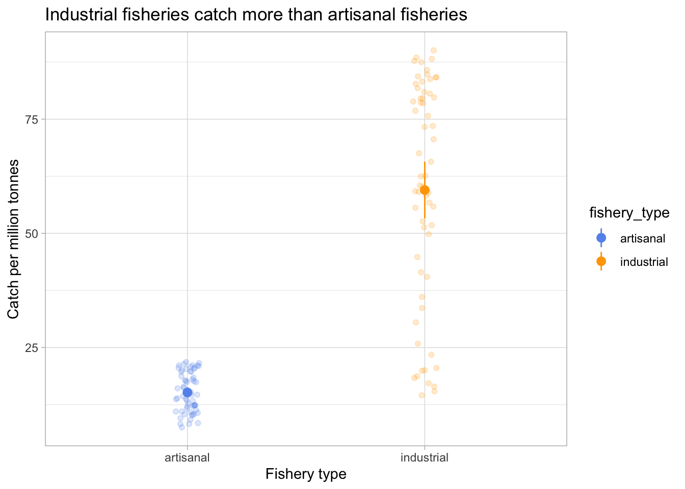
e. Visualizing the confidence interval with the underlying data
ggplot(data = global_catch_clean,
       aes(x = fishery_type,
           y = catch_mil,
           color = fishery_type)) +
  geom_point(position = position_jitter(width = 0.05,
                                        seed = 1),
             alpha = 0.2) +
  geom_pointrange(data = global_catch_summary,
                  aes(x = fishery_type,
                      y = mean,
                      ymin = mean - margin,
                      ymax = mean + margin)) +
  scale_color_manual(values = c("artisanal" = "cornflowerblue",
                                "industrial" = "orange")) +
  labs(x = "Fishery type",
       y = "Catch per million tonnes",
       title = "Industrial fisheries catch more than artisanal fisheries") +
  theme_light()